
🎯 HAP's "Aha!" Moment
This confused me at first! Prof. Teeters explained: Resolution switching (Station 2) handles different sizes of the same image. Art direction handles different compositions entirely—changing what's in the frame based on screen size. Once I understood we needed different CROPS not different SIZES, everything clicked!

HAP's Big Realization:
This is the station I mentioned being confused about on the hub page! I kept thinking "Why can't we just scale the image?" Then Prof. Teeters showed me the tree photo example, and suddenly I got it – sometimes you need different CROPS, not different SIZES. Mind = blown! 🤯
See The Problem: Interactive Demo
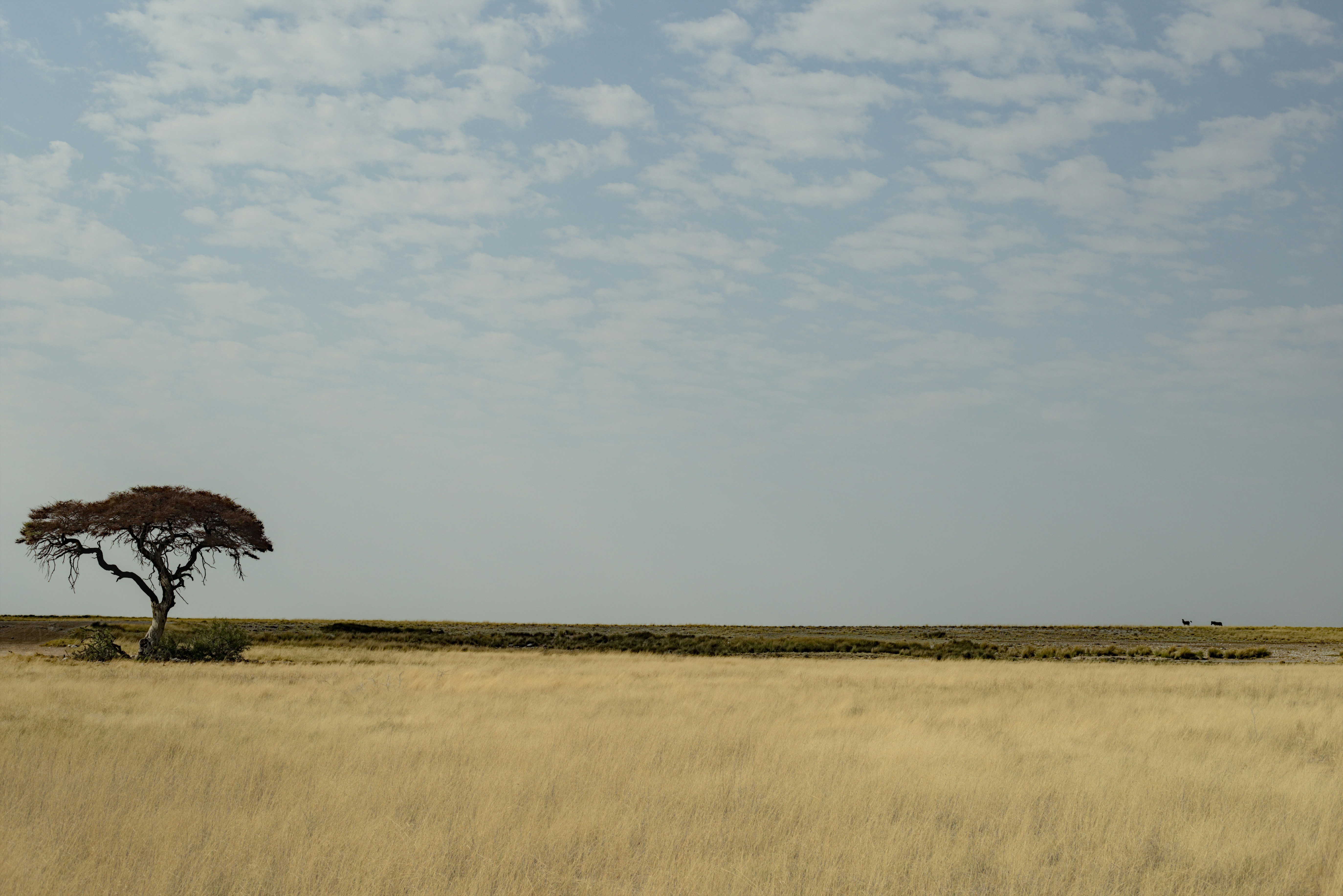
Prof. Teeters showed me this landscape photo by David Lartey (Unsplash). The tree sits far left, with vast savanna stretching right. On desktop, this composition works beautifully—the empty space emphasizes isolation, the rule of thirds creates visual tension.
But when I shrunk this to mobile width, I saw the problem! The tree is lost, pushed off the edge. The emotional impact vanishes. You're left with mostly empty grassland.
📸 Desktop (1200px)
16:9 aspect ratio
Full panoramic view
📱 Tablet (768px)
4:3 aspect ratio
Tree gets smaller
📱 Mobile (400px)
9:16 aspect ratio
Tree is lost!
🎨 HyBit's Observation
Toggle the button above to see art direction in action! Without it, the tree—the focal point—becomes progressively insignificant on smaller screens. With art direction, each screen shows a different crop that keeps the tree impactful at every size. We're not just scaling—we're recomposing.
The <picture> Element
The <picture> element forces specific crops at
specific breakpoints. Unlike srcset (which lets browsers choose), you're making
editorial decisions about what viewers see.
<picture>
  <!-- Mobile: AI-centered crop focused on tree -->
  <source media="(max-width: 640px)"
          srcset="https://res.cloudinary.com/.../c_fill,w_400,h_711,g_auto:subject/tree.jpg">

  <!-- Tablet: Fill frame with focus on left (tree) -->
  <source media="(max-width: 1024px)"
          srcset="https://res.cloudinary.com/.../c_fill,w_768,h_576,g_west/tree.jpg">

  <!-- Desktop: Full panoramic view -->
  <img src="https://res.cloudinary.com/.../tree.jpg"
       alt="Lone tree in savanna landscape">
</picture>
🎯 How It Works
The browser checks media queries top to bottom. First match wins. The
<img> provides the fallback for larger screens and browsers that don't
support <picture>.
📊 Cloudinary Parameters
c_fill = fill frame (no letterboxing)
w_400,h_711 = exact dimensions
g_auto:subject = AI detects main subject
g_west = focus on left side
Quick Decision Framework
Need Art Direction When:
- Your subject is off-center (like this tree)
- Important details become too small on mobile
- The composition needs rebalancing for different aspect ratios
- Text overlays require different backgrounds
Stay with srcset When:
- Your subject is centered and scales well
- The composition works at all sizes
- You just need resolution variations
- Simplicity is more important than editorial control
🟠 Implementation Reality Check
Art direction means creating multiple versions—not just resizing but actually recomposing.
Cloudinary makes this easier with automatic cropping parameters (c_crop,
g_auto), but you still need to decide what each screen should show.
Common Scenarios Beyond Landscapes
E-commerce Product Shots
Desktop shows product in context (table setting, lifestyle). Mobile crops to product detail (close-up of texture, features). Customers on phones get the information they need without squinting.
Portrait Photography
Desktop displays environmental portrait (subject + background story). Mobile crops to headshot (face fills frame). The emotional connection stays strong at every size.
Hero Banners with Text
Desktop uses wide banner with text overlay on right third. Mobile switches to vertical crop with text area at top. Ensures text remains readable and properly positioned.
Complex Infographics
Desktop shows full diagram with all connections. Tablet simplifies to key sections. Mobile breaks into vertical segments. Each screen gets digestible information.
Architecture Photography
Desktop captures entire building facade. Tablet crops to architectural details. Mobile focuses on signature elements. Viewers appreciate the design at appropriate detail levels.
Format Switching Bonus
While you're using <picture> for art direction, you
can also deliver modern formats:
<picture>
  <!-- Mobile: Art direction + format options -->
  <source media="(max-width: 640px)"
          srcset="mobile-crop.avif"
          type="image/avif">
  <source media="(max-width: 640px)"
          srcset="mobile-crop.webp"
          type="image/webp">
  <source media="(max-width: 640px)"
          srcset="mobile-crop.jpg">

  <!-- Desktop fallback -->
  <img src="desktop-full.jpg" alt="Description">
</picture>
🎨 HyBit's Recommendation
For most projects with art direction needs, use Cloudinary with the picture
element. Cloudinary's crop parameters (c_crop, g_auto,
g_west) make it easy to generate different compositions without manual cropping in
Photoshop. You can even add f_auto to automatically serve WebP/AVIF!
🎯 The Bottom Line
Most images just need different sizes (srcset). But when your composition breaks at
different screen sizes—when important elements get lost—that's when you need art
direction with <picture>.
For the tree image: Without art direction, mobile users see an empty field with a speck on the left. With art direction, they see a powerful solitary tree. That's the difference.